Your website sucks because you've cluttered it up
September 2022
Let’s just say that, hypothetically, I’m consuming a problematic volume of caffeine.
So I seek out an alternative, and find myself on your dried dandelion root product page.
There’s all kinds of stuff I might want to know, but my priorities are:
- What’s it look like?
- Does it seem like it’s any good?
- How much do I get?
- How much does it cost?
It’s entirely possible I’ll look to reviews to answer the second question. I’ll probably want to consider your shipping policy as part of answering the last question.
But I’m willing to scroll, or tap, to find this info. I don’t need it as a persistent element on the screen, much less one that blocks the actual content I came to look at:
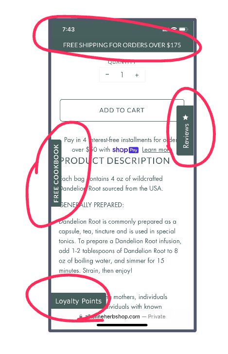
And don’t even get me started on your cookbook or loyalty program. I’m sure they’re great. Now’s just not the time.
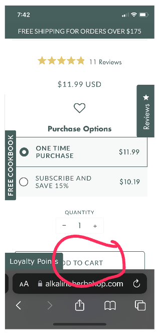
It gets worse. Supposing, somehow, I manage to ignore all this mess and make a decision, you’re blocking my path:
Here’s how to fix it
Identify the purpose of each page (or type of page) on your site. Remove, or at least minimize, any element that doesn’t contribute to that purpose.
On a product page, the purpose is to help me make a yes/no decision. Do what you want in the header, experiment with a sticky footer if you like, but make sure that actual product info is front and center at all times.
This means making sacrifices, and I know it’s hard.
You might find that you don’t have room to promote your cookbook on some pages. Or that you have to choose between a newsletter opt-in and a loyalty program promo widget, because both won’t fit.

If you’ve got a ton of traffic, you can run experiments to determine which element works best. But most likely you just have to pick one (or neither!) and move on.
And that’s okay, because the real win is choosing “get out of the user’s way” over “splatter every imaginable widget onto the screen.”
I know you can do it ᕦ(ò_óˇ)ᕤ