Those cutesy little “slide-or-fade-in” CSS effects on your homepage are pointless.
All they mean is that someone who wants to read your content has a slightly harder time than they should. They can’t just scroll and scan, they have to scroll … wait for your cutesy animation … and then scan.
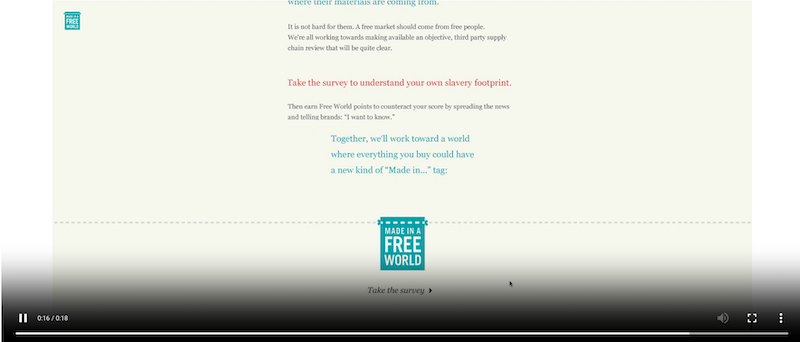
But I’ve found an example where I think these flourishes are actually appropriate. On the Slavery Footprint site, there are only two things you can do: read or take a survey.
If you choose to read, the animations serve to slow you down deliberately, because the text is short, and it’s not meant to be scanned. Here’s what it looks like:
So, I’ll walk back my position on this, just a bit. If you have a section of your site where the only action available is to read (not skim or scan!), you may use animations. Otherwise, please get rid of them.