I kinda hate Circle
December 2022
I’ve been running a Circle.so community site for the past nine months - and for the past four months I’ve been running two Circle sites.
I just shut them both down. (For multiple reasons, but this post is only for ragging on Circle.)
Editing posts on Circle sucks
It’s 2022, and there’s no excuse for an in-browser post editor to be buggy, laggy, or missing important features. WordPress solved this over a decade ago, and others have only improved on it since then.
But the Circle post editor flickers and flashes when you’re working on a post with embedded media. Elements I’m editing occasionally just … disappear. And most frustrating for me, it doesn’t recognize ⌘-K as the “add hyperlink to selected text” shortcut.
The last one’s such a nitpick - and yet, if you’re going to manage a Circle site, you’ll spend lots of time in that editor. And if the editor annoys you, congratulations! You’ve chosen a lifestyle of annoyance.
The Circle app sucks
My only gripe is that internal links - pointing to other posts, or Spaces within the site - don’t work on the app.
I reached out to support and they were like “Yeah, jeez, somebody should do something about that.”
Do other things about the app also suck? IDK! Probably! But I quit using it after discovering that it doesn’t support frickin hyperlinks.
Circle is slow af
I discovered this after running a Circle-mediated conversion audit workshop. One of the factors we looked at - which isn’t usually that important - was page speed.
In the spirit of “your website sucks, but so does mine” I used the top landing page for my Circle site to demo how to measure speed, and how to interpret the results.
My usual line about page speed is “unless it’s super slow, don’t worry about it.” Ladies and gentlemen, this is what super slow looks like:
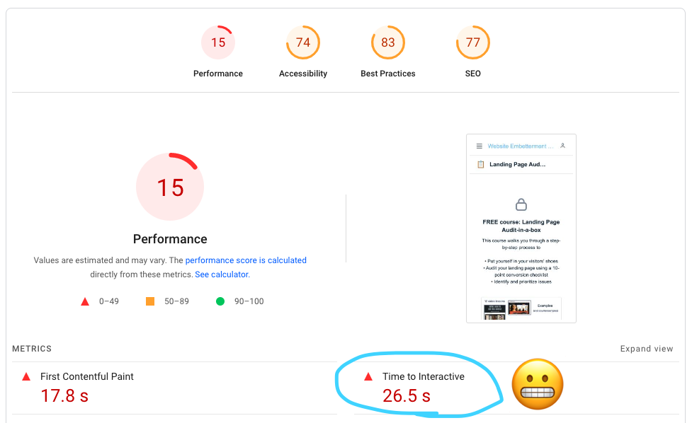
If I somehow manage to convince somebody to click on the link to my free course, they have to wait 26.5 seconds before the page becomes usable. That’s … too long. And it’s just one of the ways that …
Circle landing pages suck
The legacy landing page editor was terrible. They completely overhauled it and the new one … is also terrible.
It routinely fails to save changes.
It imposes a weird “banner - content - banner” structure on the page - why not just let me write?
The resulting layout parses simple elements like bullet points in weird, unintuitive, ugly ways.
So: using a crufty landing page builder with a buggy editor to build a slow, ugly landing page. My own personal hell.
The purchase funnel is confusing
Despite these flaws, I did manage to persuade a few people to pay for premium content. I’ll never know how many, though, because out of the ones who succeeded, all but one had to email me for help with checkout.
It appears that they were logged in to another Circle site, and that this breaks the checkout flow, and the solution is … to tell them to complete the purchase in an Incognito window?
Some folks actually did this, bless them. No telling how many tried, and gave up. I know I would have!
To sum up: using Circle enabled me to use a buggy UI in order to create terrible landing pages, pointing to a broken checkout process. I paid for this privilege.
I’m not sure what the lesson is here. If you’re trying out Circle, be sure to spend time in the editor, stand up a landing page, and do some test checkouts on multiple browsers before you commit. Maybe I’m just a diva who’s bad at computers. Or maybe they’ve fixed all these issues by the time you read this!
I doubt it, though. That “new landing page builder that also sucks” was part of a total redesign they recently shipped, which improved literally nothing from my perspective. They then proceeded to start piling on equally buggy features, like Events (buggy) and Courses (buggy).
Not sure where this platform is headed, but it sure looks like “towards a ton of features and even more technical debt.”
I guess I’ll just stick with hosting meetups and 👇 emailing people.